 Networth Tracker
Home Page Wireframe

Home Page Design Decisions
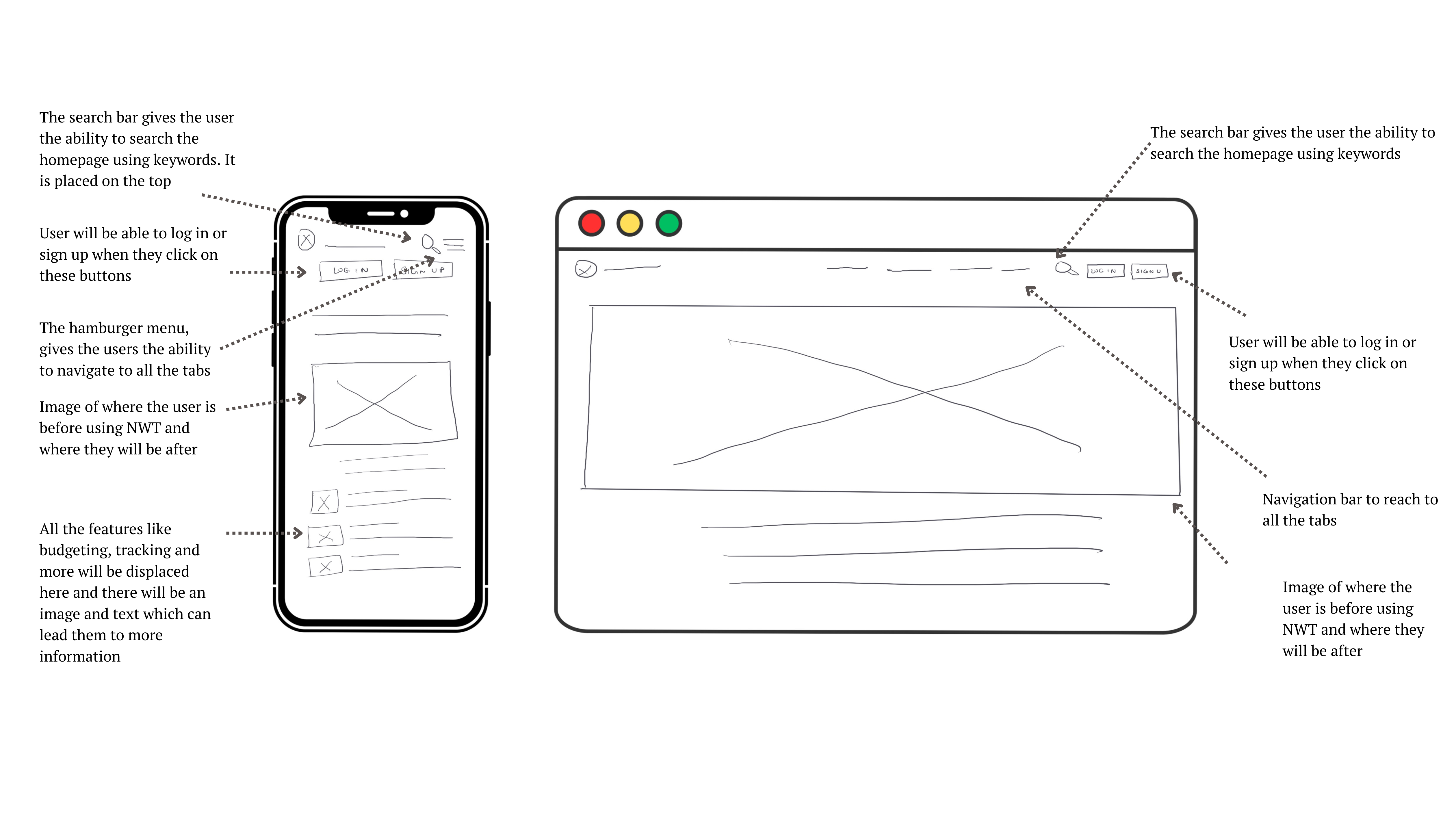
Search Bar: The search bar is prominently positioned at the top of both mobile and web layouts. This strategic placement ensures high visibility and easy accessibility, allowing users to quickly find and utilize the search function for locating relevant information using keywords.
Navigation Bar: For the mobile interface, I’ve implemented a hamburger menu to house the navigation options. This decision was made due to the limited screen real estate on mobile devices, allowing us to maintain a clean, uncluttered interface while still providing access to all necessary navigation elements.On the web version, the navigation bar is placed at the top of the screen. This conventional placement aligns with user expectations and provides easy access to different sections of the website.
Log in and Sign up: The log in and sign up buttons are crucial for user engagement and conversion. To emphasize their importance, I’ve made these buttons highly visible and easily accessible in both mobile and web versions. They are highlighted to draw user attention and encourage action.
Hero Image: The hero image, consistent across both mobile and web versions, serves a dual purpose. It visually represents the user’s financial journey, contrasting their financial status before and after using Networth Tracker. This immediate visual comparison aims to demonstrate the app’s value proposition and encourage user engagement.
Features: For the mobile interface, I’ve designed feature tabs with small icons and concise titles. This approach allows us to showcase multiple features in a space-efficient manner, providing users with a quick overview of the app’s capabilities without overwhelming the limited mobile screen space.
Dashboard Wireframe

Dashboard Design Decisions
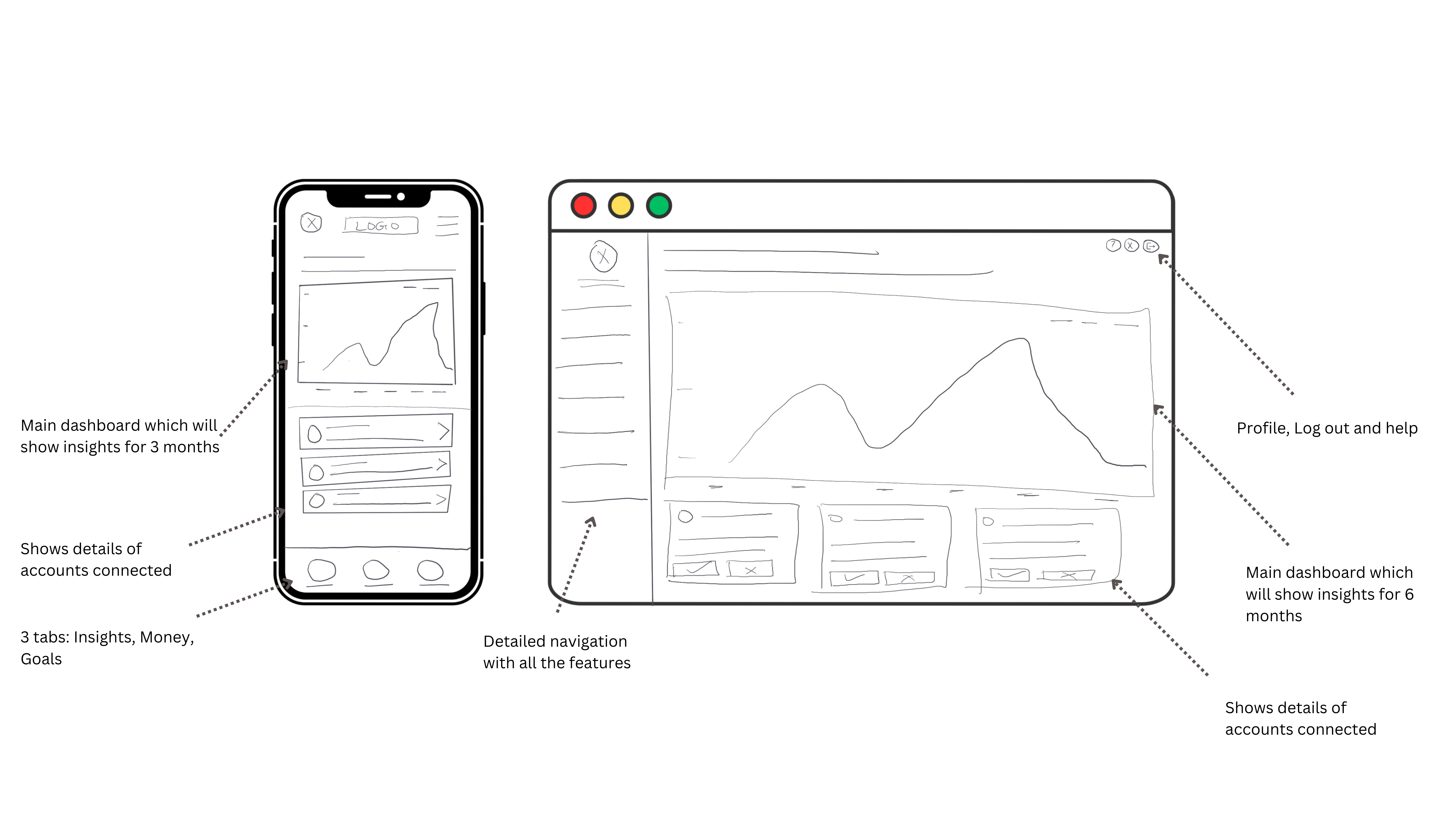
Profile Access: For the mobile interface, I’ve strategically placed the profile access within the hamburger menu. This decision optimizes screen space while ensuring that users can easily access their profile information when needed.Web VersionOn the web platform, I’ve positioned the profile, help, and log out buttons in the top right corner. This conventional placement aligns with user expectations and provides quick access to these essential functions.
Dashboard: The dashboard is a crucial element, displaying the user’s networth information.On mobile, the dashboard presents data for the past 3 months. This timeframe provides a concise overview suitable for smaller screens.The web version expands this view to 6 months, taking advantage of the larger screen real estate to offer a more comprehensive financial picture.Both versions allow users to access more detailed information and adjust the time frame, ensuring flexibility and depth of information as needed.Connected Accounts Details: I’ve designed both mobile and web versions to provide easy access to details of all connected accounts.The web interface offers additional functionality, allowing users to edit or delete connected accounts directly. This feature gives users greater control over their financial data representation.Navigation: For mobile, I’ve implemented a bottom navigation bar featuring the three main tabs: Insights, Money, and Goals. This placement ensures these critical navigation elements are always within thumb’s reach, enhancing usability on smaller screens.Web Version: On the web platform, I’ve placed a more detailed navigation menu on the left side of the screen. This layout utilizes the additional space available on larger screens, providing a comprehensive view of all navigation options while maintaining a clean, organized interface.
Tool Kit

Lets get to work
I appreciate you taking the time to explore my work. I’m excited to learn more about your project and how I can help.
Feel free to reach out anytime.
© 2024 All rights reserved. Designed by Khyati Gandhi
